Éla Architecture - Paris
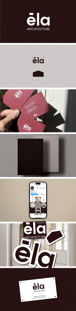
Projet d'itentité globale pour Éla Architecture, cabinet basé à Paris. Création d'un logotype épuré qui saura traverser le temps avec élégance et simplicité. La forme principale des trois lettres forme le toit d'une maison, un plan, un assemblage de ligne, une analogie au métier d'architecte.
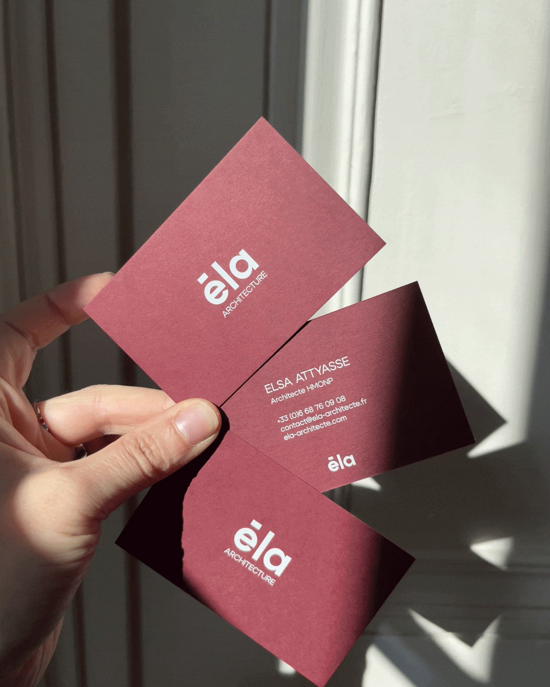
Less is more, c'est le centre de ce branding en 2 tons. Les cartes de visite sont imprimées en letter press pour une finition haut de gamme.
Branding
Conception/DA
Recherches de couleurs
développement système graphique
Social Media content
Logotype
Cartes de visite
Éla Architecture - Paris
Global identity project for Éla Architecture, a Paris-based firm. Creation of a clean, minimalist logo that will stand the test of time with elegance and simplicity. The main shape of the three letters forms the roof of a house, a plan, an assembly of lines, an analogy to the profession of architect. "Less is more" is the core of this two-tone branding. The business cards are letterpress printed for a high-end finish.
Branding
Artistic direction
Colors research
graphic system development
Social Media content
Logotype
Business cards